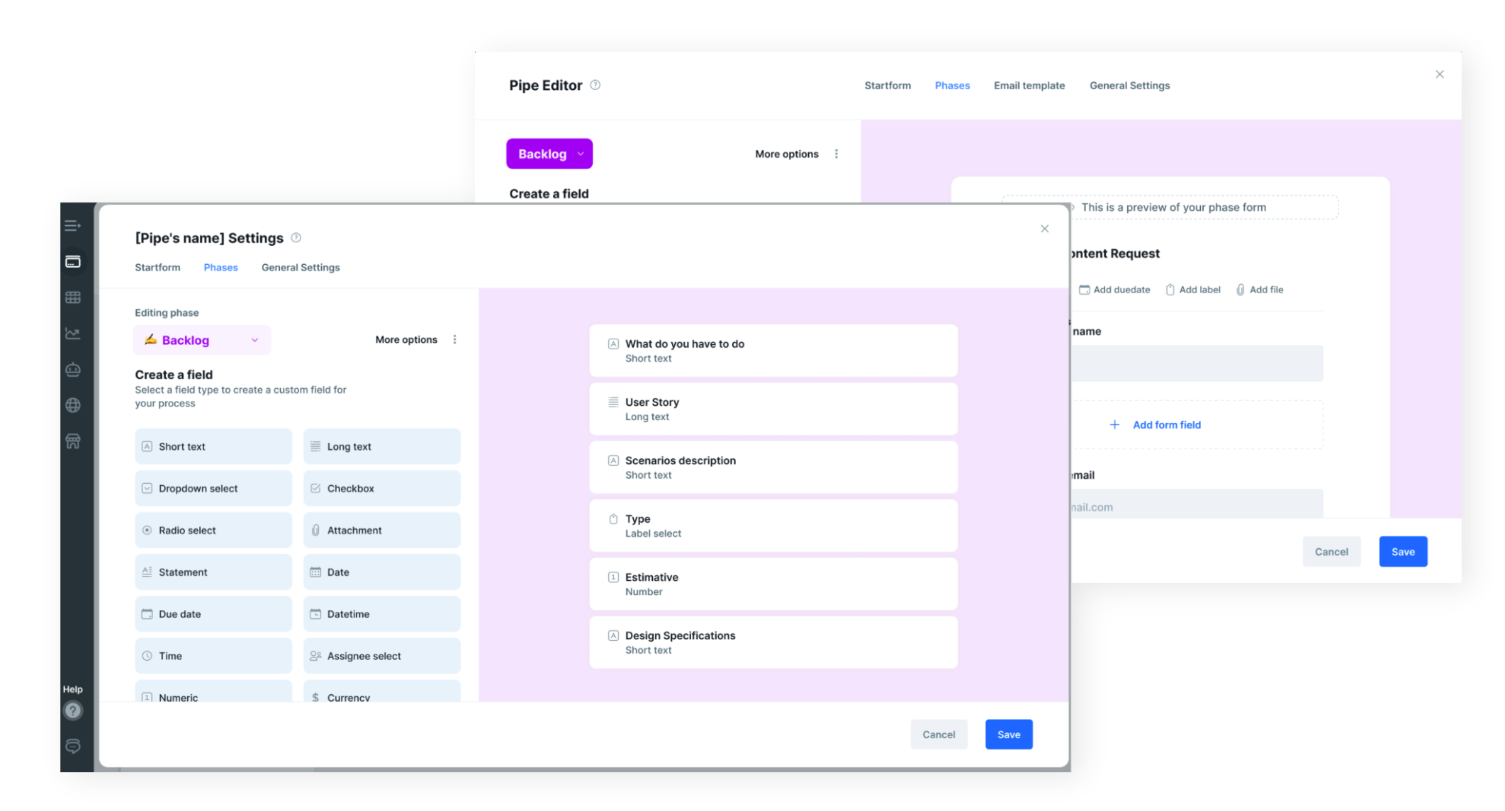
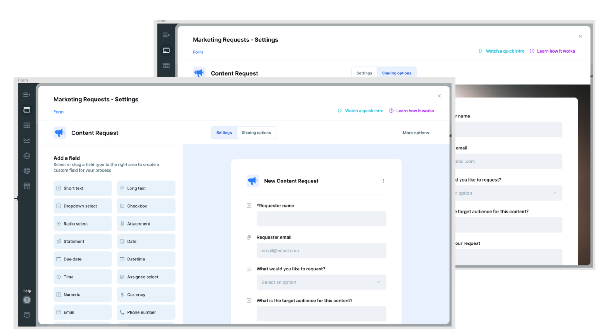
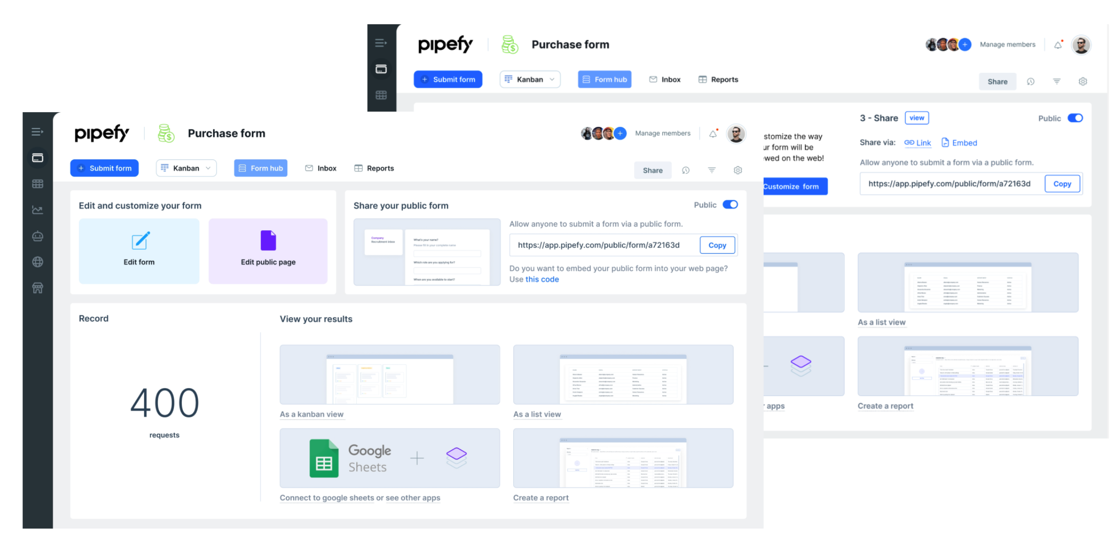
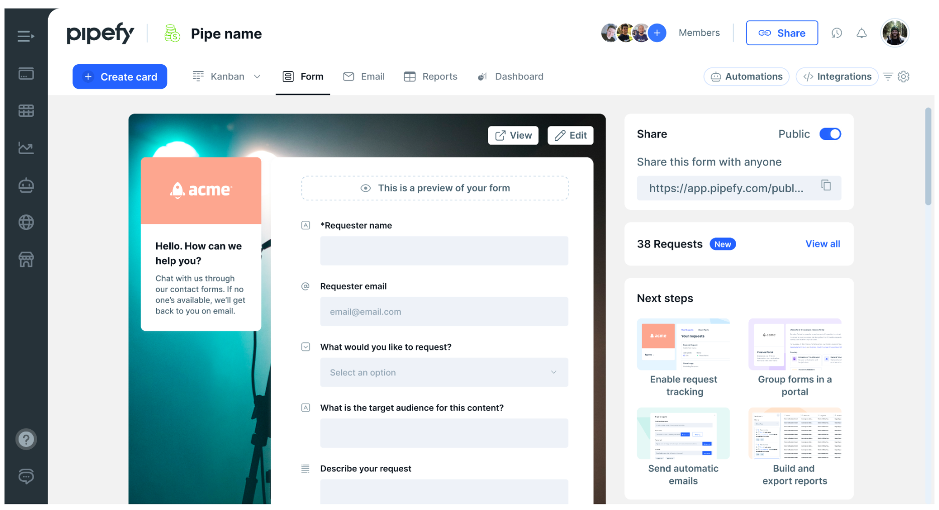
Form Builder Redesign
## key insight
The team assumed drop-off was at step 1 — the first impression. Mixpanel said step 3. That single finding changed the entire scope. We fixed the right thing instead of polishing the wrong one.
## the challenge
The form builder was the front door to the entire product. Teams either built their first form in the first session or they churned. The old experience exposed every option at once and assumed you already knew what you wanted. New users did not.
## architecture & process
┌─Mixpanel + Amplitude funnel analysis· revealed step 3 as real drop-off, not step 1
├─FullStory session recording· qualitative validation of exact friction points
├─Step 3 targeted redesign· progressive disclosure, simpler first path
├─Maze unmod usability testing· validated before engineering committed
└─A/B testing + interview protocol· written here, adopted as org standard
## key decisions
- Led with data before any design work — Mixpanel and Amplitude funnel analysis first. No wireframe until we knew where users actually dropped off.
- Redesigned step 3 specifically, not the entire flow. Scoped right, shipped fast, results attributable.
- Progressive disclosure over feature-complete UI. Simple by default, complex on demand.
- Wrote the A/B testing + user interview validation protocol. It was adopted as the organization's standard design validation process.
## results
178%
of retention goal hit
+40%
user sign-ups
+40%
overall feature adoption
org std
A/B protocol adopted org-wide
## tools used
FigmaMixpanelAmplitudeMetabaseMazeFullStory
## screens